+ inload: Building Epic Land Raiders +

+ Notes on the Epic Land Raiders +

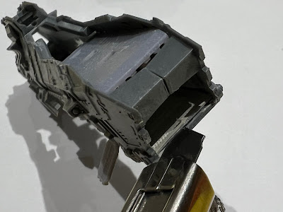
+ A box of the grandly-titled 'Legions Astartes Land Raider Proteus Explorator Squadron' arrived safely at my door yesterday, and I couldn't resist getting building. These are fun little tanks, but as I found a few little quirks in the build, I thought I'd flag them up to help forewarn other intrepid Enginseers. +

+ SCRAPSHUNTERRORABORT +

+ The key thing to note is that there are a couple of errors in the build instructions. Rest assured that these aren't at all difficult to overcome, but since it affects the numbers of some tiny fiddly bits, it's worth knowing. +


+ The error occurs in step 2a [+VIZREF: above+], where you're directed to put the tank's drive wheels into the side of the tank. To save you some searching, the part marked '8' does not exist (and nor does the corresponding piece on the other tracks). Presumably this component was adjusted to be built into the track unit at some point, and the instructions have not been updated. +


+ The numbering on the sprue and instructions therefore diverge from this point on. Component 7 (the Land Raider's left track section) is correct; but the Land Raider's right track section is actually component 8 on the sprue. Components 8 and 10 in the instructions do not exist. +

+ You can ignore steps 2a and 2b entirely. +

+ Once you're aware of this, the rest of the build proceeds as directed, except that you need to deduct two from each reference in the instructions to get the correct component number. Below is a marked-up copy of the final steps, with the correct numbers in red. +

+++

+ On the bright side +

+ The mistake is undoubtedly a minor annoyance when building, but shouldn't overshadow what is a lovely litle kit. The components are wonderfully engineered and go together well; the two-part top being a particularly interesting construction that literally locks together in a way I've not seen before from GW. +

+ Leaving the mistake in the instructions aside, these tiny Land Raiders are a treat to put together, with far fewer fiddly bits than the Rhinos and Predators, whose separate exhausts are a chore. The lascannon sponsons are also arranged on the sprue better, with the joins avoiding the most delicate parts, helping to avoid putting strain on the gun barrels when removing them. The only other thing that I would flag up is component 3 on the sprue (the odd radiator thing that sits at the front of the chassis), as I nearly bent the side parts in removing it from the sprue. +

+++

+ The completed model, lascannons and exhausts drilled out and commander perched waving merrily to his mum vigilantly scanning for greenskins. +

+ It's a pure guess, but I presume that the change must have happened quite late on in the process, and that the drive wheel components were replaced on the sprue with extra hatches and gunners, because  the silver lining of the error seems to be that you get an absolute pile of crew members and hatches. +

+ Every sprue contains three tanks, but four identical gunners plus a commander. Unlike the Predator and Rhino sprues, which have a single pintle-mounted gun (a multimelta and heavy bolter for each kit respectively), each Land Raider sprue gives you three pintle-mounted heavy bolters plus a single multimelta. While this is more than you can use for the Land Raiders themselves, these extra crew members and guns are useful both in game terms (as Rhinos, oddly, can take in-game multi-meltas), and for visual variety. +

+ If you're picking up a box alongside other kits, you'll end up with some useful spares, so bear that in mind. +

+++

+ The Salamanders are having a tough time of it on Armageddon, so doubtless they'll appreciate the arrival of some heavy armour! Come read more about the ongoing campaign through the noosphericexloadlink below, and remember that all you need do to get involved is to use the tag #ashesofarmageddon +

+ THE ASHES OF ARMAGEDDON: HADES DEFIANT +


+ inload: Notes on finished Epic Salamanders +

+ Battlefield ready +

+ Permission to make planetfall requested. +

Phew – over the finish line with a little grace to spare. There are some further refinements that could be done, but I think my Salamanders army is ready to spend the weekend searching for Archaeotech on Nabed-Palae, the Forge-throne of Legio Maximal. +

+++

+ Markings and details +

+ As well as polish off the tanks and transport, I've finished the Thunderhawk and big guns – and spent a few minutes adding some banner detail to this Command stand, too. +

+ Being themed around Armageddon, I took a little inspiration from the boxed game cover [+vizref: below+] and used the shoulder pad on this marine as a prompt for the banner. +

+ Detail from the Battle for Armageddon box set front +

+ It's easy to just go with the most modern reference for a sense of accuracy or canonicity, but early references often include really cool details that have been lost or forgotten over the years as the aesthetic of 40k in general, or a faction in particular has developed. Apart from anything else, moving away from the studio standard is a great way of setting your army apart, while still fitting well into the universe. +

+ The heraldic patterning here is a perfect example – chequers are still 'peak 40k', but the interesting wobbly lines at the bottom ('shallow nebulé' in heraldic terms, so I understand) not only look great, but evoke the patterning of real-world salamanders. The idea of Salamanders  might have moved away from the mythical fire-amphibians towards GIANT VOLCANO DINOSAURS in modern 40k, but they both evoke the period and look fittingly knightly. More importantly, they're fun to paint. +

+++


+ Another old reference here, a couple of friends, online and off, suggested I use the Salamanders markings from an old White Dwarf article [+noosphericinloadlink embedded+]. I have slightly adapted things – Assault squads can no longer go in Rhinos, and I've used the spades suit device rather than hearts, but the yellow on black doors show how effective simple symbols are. Good advice is good advice, even if it's twenty-odd years old. +

+ Of course, a few late nights meant that I wasn't concentrating perhaps as hard as I should have been, and so I've got seven of one icon and nine of the other... If I get a spare minute or two, I'll repaint one of the diamonds to a spade, just to make the niggle in my head go away! +
+++

+ Thunderhawk inbound +

+ Perhaps my favourite bit I polished off last night was the Thunderhawk, which needs a suitable name. The base isn't very visible here, which is a bit of a shame as I was pleased with it. It uses a Maximal Fire crate, as a bit of a nod to the event at which it'll get its blooding. Anyway, I'll get some better pic-captures another time – for the moment, suffice to say that it's a 90 x 52mm oval, rather than the standard 40mm base supplied. This might have some game effects, so I'll keep a spare 'proper' base handy. The reason I went for a bigger base was primarily visual appeal (a bigger base gives a bigger canvas), but also for stability. I glued some tupenny bits to the underside to give some weight, too. +

+ Finishing the Thunderhawk was an exercise in speed against effectiveness. I like the weathered, painterly feel of the rest of the army, but as a focal point, I wanted this to look a little cleaner and take it a little further. Besides, as an aircraft (even a 40k one), the same sort of dusty weathering wasn't as appropriate. This had to be balanced against the time available. +


+ To that end I added some tighter, harder edge highlighting. For panel-laden Space Marine vehicles, I find the challenge is in knowing which edges to highlight. Too many make the model appear to be glowing; while too few, or in the wrong places, simply look odd. +


+ The zenithal basecoating I'd applied helped here – anywhere that had deeper recesses naturally created bigger contrasts, so these prompted me to push them a little more. I also looked at reinforcing the overall 'outline' of the Thunderhawk, so you can see that parts within the form are emphasised less than the leading/trailing edges of the wings, or the pointed prow (is that the right term for the front of a Thunderhawk?). +

+ You'll also spot the marine leaning out of the open hatch. Observing? Preparing for landing? Simply taking in the view? Who knows – but he adds both a little narrative and draws the eye to the Battle Bling open hatch. You can read my review and step-by-step on this upgrade set in this inload [+noosphericinloadlink embedded+]. +

+ The marine is a spare Apothecary left over from sprues. You'll probably end up with a little pile of extra Command models, and adding them to add flavour to focal points in your army is a nice way to make use of them. I trimmed off his sword so he could be gripping the edge of the hatchway. +


+ Visible in this picture is the 'club' symbol of Assault Squads – while I don't want to treat this as a dedicated transport, it seems most likely that it'll be used aggressively to deploy troops. This, along with the black bars and bronze/gold trim, helps to tie it in with the rest of the army, despite the slightly different painting treatment. +

+ The blue plasma glow of the upgraded turbolaser didn't come out as clean as I'd like – and that's down to me putting on blue contrast paint too early. The white hadn't quite dried, which meant I had to start again. The lesson here is 'more haste, less speed'. A few extra seconds waiting would have saved minutes repainting, and given a better result. +


+ The front shows the white flame markings – an attempt to move the model a little away from 80s hot rods – and the lenses of the targetting systems above the cockpit. +


+ I was pleased with how the cockpit glass came out. I used orange, which always works well with green, and painted a very simple landscape on each pane. Two things to remember for this effect:
  • The sky is dark at the top and gets lighter towards the horizon, while the land is darkest at the horizon and lightest in the foreground.
  • The glass is at different angles, so (unless you've modelled it in a very steep dive!) the front panes won't be reflecting the horizon halfway up the glass, but rather near the bottom. Likewise the top panes of glass won't be reflecting the ground at all, but instead show the darkest tone of the sky across nearly the whole panel. 
+ Ultimately, what is being reflected is a single continuous thing: the surroundings. Each pane of glass is reflecting just a portion of it – so make sure that's all you paint. +

+ If you're unsure, I suggest starting at the panes at the side of the cockpit. Not only are these slightly less obvious if you make a mistake, but they're also near perpendicular to the ground. This will allow you to establish the horizon, and the tones you're using. Treat the other panes as extensions of that – so you can continue the line of the horizon round to the front, for example, or use the tone at the top of the side panel as your starting point for the upper panes. +

+++

+ inload: Tips for painting Epic-scale models for Legions Imperialis +

 + Lesson from painting Epic models +


+ I thought I'd scribble down some notes on painting Epic models;  perhaps they'll be helpful to you – or at least let you avoid my mistakes! +

+++

+ Detailing Epic models +

+ Theoretical +

+ Epic-scale models present different challenges to larger scales, and offer a good lesson in simplification. The new Epic Legions Imperialis models are quarter of the size of their 40k counterparts, and unlike older Epic models, are minimally adapted to the new scale, without the exaggeration of the Epic 40,000-era amodels, such as the Dreadnoughts here [+noosphericinloadlink embedded+]: +

Even in death I still serve (as an example of stylistic changes in sculpting).

+ Techniques and approaches that work at 40k don't necessarily translate well. Subtle highlights and shading get lost or look muddy, and if you try to replicate what you did for your larger models, you're effectively painting with a brush four times the size you'd use for their larger counterparts. +

+ I've found it better to take a step back and re-assess. Depending on the effect you want, of course, the key points I'd flag when swapping to Epic scale are:
  1. Lost light  Small models reflect less light – so need to be treated differently.
  2. The crowd effect  As a mass, Epic models show less individuality than their 40k equivalents. Differences clear at 40k scale might be lost entirely for Epic models at table distance.
  3. Space for variation  Mass models are more visually coherent, so variations in painting and finishing offer opportunities for personalisation that won't 'read' at typical distances.

+ Practical +

+ Lost light +
+ Highlighting on models is intended to simulate the amount of light reflected from the full-scale object – that's what makes a model look like something big at a distance, rather than small and close up. +

Highlighting and shading on the Rhino add visual texture and detail that make the surfaces look more distant than the flatter planes of the base-coated Thunderhawk.

+ In other words, a full sized Space Marine would need no highlighting, because the surfaces would naturally reflect the right amount of light. A 40k-scale model requires you to artificially exaggerate the highlighting and shading through use of paint. +

+ At quarter of the size of the 40k Space Marine, the contrast between light and dark areas of an Epic model needs to be pushed that much more to get a similar visual impact. +

Of note is that this might not be the style you want – loss of detail and reduction in saturation and contrast are real world signifier of distance, thanks to aerial perspective. As a result, you might want to simulate this for a particular effect – in which case you need to steer clear of edge highlighting and surface modelling.

+++

+ This is where techniques suitable for 40k don't necessarily translate. The reasons for this vary by technique. To take layering as an example, each layer of paint you add is proportionally four times thicker; the brushstrokes four times more obvious. This means you should be careful with the number of layers – you might not notice it on a 40k scale tank, but an Epic one will start to pick up texture four times faster. +

+ The answer to this? At its most simple, use a light touch. The good news is that because the areas you are covering are smaller, it's easier to get good coverage with fewer layers. Be sparing, and avoid overworking things. +

+++

+ Surface tension is another consideration. Whatever the size you're working, the surface tension of water is going to be consistent. When using thinned paints, you'll need to adapt to working in small areas. At Epic scale, there are fewer large, smooth areas, and relatively more greebling that means fluid paints won't necessarily behave in quite the way you're expecting. +

+ You can use flow improver medium to help adapt to this (I recommend this anyway), but it's also important not to treat this change as inherently problematic. It's as much an advantage as anything, as the smaller surfaces mean less puddling and pooling. +

+ Contrast paints really come into their own here, and while I've only used Black Templar for these models, I thoroughly recommend their use for Epic in general – they're ideal for turning all the points above into advantages, naturally giving richer, more saturated and cleaner results than on 40k models. +

+++

+ The crowd effect +

+ What do I mean that Epic-scale models show less individuality than 40k-scale models? Simply that at typical working distances, Epic-scale models are far less visually distinct from one another, which you should be aware of. The combination of there being more of them, and each individual figure or tank being smaller (and thus giving less space for conversion work than their 40k equivalents) means that they'll tend to blend into one another more. +

+ Uniformity isn't necessarily a bad thing – indeed, massed ranks of similar models is a key part of the appeal of Epic scale gaming. Nevertheless, it's worth being aware of it both for display and for gaming reasons. +

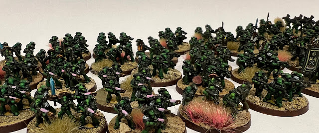
+ The image below shows my Salamanders infantry. See how quick you are to identify the various different types in relative close-up:

+ Included here are Tactical stands, Missile Launcher Devastators, Terminators and Command stands. +

+ ... and again, at roughly half the size; something closer to tabletop distance. +

+ Included here are Tactical stands, Plasma support stands, Missile Launcher Devastators, Terminators and Command stands. +

+ As I hope this demonstrates, at table distance all these different types tend to blend into one another. You might, of course, rather like this – the sea of infantry is definitely a look I favour – but if you want immediate identification, consider exaggerating the differences. You might paint plasma weaponry in a more strongly-contrasting accent than at 40k scale, for example. +


+ Gun casings are a good place to add an eye-catching marking, or even paint different types of weapon with different colours. This would probably look a bit too obvious at 40k scale, but Epic-scale can stand a little less consistency in such details, in favour of being easier to 'read'. +

+++

+ Markings are also worth thinking about. Space is at a premium, and  since you have so many more models, identification becomes more important. The work-in-progress armour below shows models prior to the markings being added. +


They're perfectly servicable, and you could happily game with them at this stage, but markings will both add character and help draw the viewer's eye. This is beneficial whether you're intending them for display or gaming. For display, such details stop the eye drifting over the mass (the crowd effect) and serve as visual punctation. For gaming, markings will help you and the other players to identify particular detachments or formations – particularly useful to spot where one group starts and ends. +

+ As a nod to a 2nd edition Space Marine article and the artwork to The Battle for Armageddon boxed game, I'm intending to use the symbols from a deck of cards for my army. This will also be handy on the army list, as I can put the relevant symbol next to the infantry each group of Rhinos is carrying – little touches like this can help speed of comprehension and avoid misunderstandings. +


+ Make sure they're readable! This test model shows the importance of checking things and practice. Just about visible here are 'club' symbols. For a 40k-scale model, I think they'd work well, clear but not too over the top. For these Epic models at table distance, however, the markings are nothing more than blobs. For future models, I'll take up much of the top hatch with the appopriate symbol. +

+ When choosing symbols, I suggest that you keep things clear and simple. Numerals, letters, Codex markings... all will work well. +

+++

+ Space for variation and personalisation +

+ The flip side of things being lost at small scale is that you can have lots of fun with extra detailing, if you want! As there's less stuff at the right size, and a smaller range overall, there's less opportunity for easy kitbashing than at 40k scale. +

+ That's not to say it's impossible, of course. As with any army, it's worth spending a little time personalising your characters – as with the Captain here, who's had a weapon swap and his Mark VI helmet exchanged for a Mark II one from a spare Rhino gunner. +


+ However, such details are almost certain to be lost – even to an interested observer – unless you point them out. Does this make them not worth doing? Of course not! Such customisation is fun – and that's really the key thing to take away from painting Epic models. They're quick, and fun, and surprisingly different from painting 40k-scale models. +


+ The scale does necessitate some compromises. The banner here, for example is a simplification of the 40k-era 2nd Company banner (as my army's themed around the Second War for Armageddon) – and while I've taken more time on this stand than the others (eye lenses on the models, for example), I've consciously avoided getting sucked down a rabbit hole of trying to superdetail such tiny figures. While it's possible, it's beyond my current skill level, and my priority is to get a gaming army together. +

+ This picture also shows another good example of simplification: the Salamanders' Chapter badge – visible on the Tactical stand on the right-hand side of the picture. At this scale, it's clear that it's a super-simplified version of the icon – but even this is unnecessary.  +

+ Decide before you begin what you want to simplify; and whether you want to include such detail at all. There is no shame at all in a simple approach – as we've seen above, you can spend a great deal of effort in gilding the lily, and creating detail that will be seen only vanishingly rarely, even on the display shelf. +

+ In summary, my advice is to concentrate on that mass of figures – get the impact through simplicity and leaning into the inherent advantages that Epic scale gives you. +

+++

+ The Corsair Gambit +

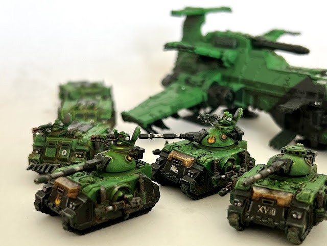
+ Time is closing in for me to complete my Salamanders in time for this event, but painting is progressing. Above you can see the first three Predators of Destructor Squadron, which I polished off after getting a bit bored with batch painting the remaining tanks. +


+ The list from this inload [+noosphericinloadlink embedded+] details what needed to be done; so here's an update:

+ Completed since +
  • One additional stand of Terminators
  • Two stands of Assault Marines
  • Support: Four Dreadnoughts
  • Support: Four Dreadnoughts
  • Battle Tank: Three Predators
  • Transport: Eight Rhinos
+ Still to do +
  • Air Support: Thunderhawk Gunship
  • Bastion: Four Tarantulas
  • Battle Tank: Six Predators
  • Transport: Five Rhinos.
  • Transport: Five Rhinos.
  • Three objectives
+ Aside from the objectives, which are primed at best, the remainder has had the black and metalwork picked out, and is ready for washes, highlights and detailing. I'm hoping to have that all done after Wednesday night, giving me a day's grace in detailing. +

+ inload: Epic Salamander Dreadnoughts +

+ March of the Ancients +

+ Get off my planet, you dang orks! +


+ The army progresses apace, and two more Detachments have been completed: the Dreadnoughts. +

+ While I like the Contemptor model, the good old box dreadnought better captures the idea of a coffin attached to a walking tank – and it's definitely more thematically appropriate to the Second Battle for Armageddon campaign in which The Ashes of Armageddon is set. +


+ These were painted using the same technique as the rest of the army; the only real differences being that the bases were painted with the model in place, rather than prepared separately and attached at the end. This is because these metal models have a little tab base that I hid under the base texture prior to priming. +

+++

+  History of the Epic Dreadnought + 

+ This version of the Space Marine Dreadnought was the last one released prior to the new plastic Contemptor. As part of the Epic: 40,000 release in 1997, they were designed – along with much else in this generation of Epic releases – by Tim Adcock. +

Unlike the Epic: Legions Imperialis release, which are nearly exact quarter-scale replicas, it's interesting to see how Adcock has taken Jes Goodwin's 40k-scale Dreadnought and slightly exaggerated particular elements to help the model 'read' on the table. This was a common design theme running through all the Epic models of the period; generally making the guns a hint larger in terms of relative proportion. + 

+ Pic from Stuff of Legend +


+ The result is a wonderfully chunky set of models – and you'll note that it's not just a single sculpt, but a full range. This was another common thread for the Epic 40,000 sculpts, with most vehicles (or equivalents) having multiple mix-and-match options for hulls, turrets and so forth, giving an absolutely colossal potential for variety. + 

+ As an aside, this provided an interesting insight into how the GW design studio envisaged models that would only ever had one variation at 40k scale (such as the Eldar Falcon, which had four hulls with slightly different sensor suites and equipment blister placements). +  

+ The models were sold in an unusual sort of blister pack that I think was unique to Epic: 40,000. I could have sworn that they came with a standard variety of arm sprues, but this one, bought from Ebay, only included lascannons. + 


+ Pleasingly chunky little beasties, these painted up nice and quickly alongside the others I've managed to pick up. +

+++

+ In truth, I hadn't intended to end up with quite such a group! I prefer to think of Dreadnoughts as very rare, with perhaps one or two per Company, so a group like the one below seems a bit excessive. Even if the Armageddon campaign did involve the whole Chapter, it seems unlikely they'd all be fielded... +  


My original intention had been to have half a dozen or so of these Dreadnoughts alongside two or three Contemptors. In any case, never mind – if it's a bit excessive for the 41st Millennium, entire Talons of Dreadnoughts are at least fitting for the colossal battles of the Horus Heresy. +

+  As you can see above, I've tried to reflect the character of these Dreadnoughts as the carriers of ancient heroes, with a little bit of distinctiveness provided to each through colour placement and markings. You'll see a variety of black panels, flame markings and so forth on individuals – but they still hang together well. +

+++

+ inload: Painting for The Corsair Gambit +

+ The Corsair Gambit +

+ Vanguard Detachment of Outriders +

+ I'm taking my Salamanders down to take part in the investigation and retrieval of critical archeotech from the planet Nabed-Paleae in Maximal Fire's Corsair Gambit event (you can inload the event pack here [+noosphericexloadlink embedded+]) – so I thought I'd track my progress subroutines from 'confident/plenty of time' to 'weeping at 4am'. +

+ Here's where the 1,500pt army currently stands; I have 10 days to get it all up to scratch. If you'd like the painting method, the  colours and process are detailed in this inload [+noosphericinloadlink embedded+]. +

+ MIA +

+ The picture above shows the vast majority of the army. Missing here are:
  • One additional stand of Terminators
  • Two stands of Assault Marines
  • A proper base for the Thunderhawk
  • Three objectives – the are optional, so a bit of a stretch goal.
+ The remaining infantry are at the same stage as the Thunderhawk – primed brown and with a zenithal spray of Colour Forge's Salamander green. I've also got their bases all complete – so they can be stuck on quickly once they're painted. +

+++

+ What needs painting? +

+ Bar the Thunderhawk, which is at the earlier sprayed-green stage, everything has had the black parts picked out. My plan is to tackle an in-game Detachment at a time, which means I have the following to do. From left to right in the picture above:
  • Air Support: Thunderhawk Gunship
  • Support: Four Dreadnoughts
  • Support: Four Dreadnoughts
  • Bastion: Four Tarantulas
  • Transport: Five Rhinos
  • Transport: Eight Rhinos
  • Battle Tank: Nine Predators
  • Transport: Five Rhinos (as three are already complete).
+ That's a Detachment a day, with two days for overrun and quickly polish off the extras. It seems doable – if rather more snug than I'd intended! Some, like the Dreadnoughts and additional Assault marines, will be much quicker than others, and I'm hoping transfers might make the vehicles a bit more swift. +

+ Anyway, that's the plan – wish me luck! +

+++

+ Outriders +

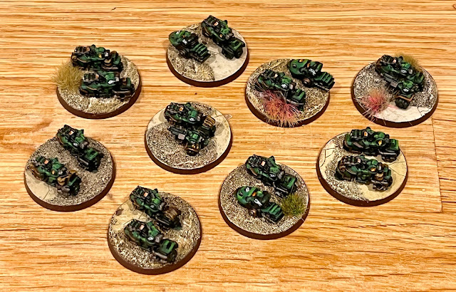
+ This was the most recent detachment to get worked up from a similar green-and-black stage. Painted on a spare bit of sprue and then glued onto pre-prepped bases, they took around two hours. +


+ Built for The Ashes of Armageddon mini-game I'm working on, rules for the outriders in the Horus Heresy era are in the latest expansion for Legions Imperialis, The Great Slaughter. Since these bikers had hung around unpainted since (yikes) 2014, I felt their time had come. +


+ Quick and simple to paint, I adapted the process in the linked inload above for them. The models are a mix of Space Marine 2nd edition plastics and the metal ones released for Epic: Armageddon. I like the variety this creates, and having some of the old plastics will help to blur the gaps between these and any new of the new ones I might add in the future. +


+ You'll spot a couple of Attack Bikes in here – these won't have any in-game effect for Epic: Legions Imperialis, but will allow them to pull double duty for any other Epic games. Besides, they look nice, which is the best reason for ever painting models! +


+ As with the infantry, I varied the markings on the shoulders a little, with the Legion/Chapter badge mostly on the right pauldron, but sometimes on the left and sometimes supplemented by flame markings. +

+ Pure uniformity can look great, but much as I like personality at 40k scale, I think my Marines deserve their personal heraldry at Epic scale. It's a (literally) little thing, but I hope it makes the army as a whole feel more grounded, and give a sense that these are individual soldiers, not tokens. +


+ The infantry have been completed for a while – I've been resting on my laurels a bit with them. It's nice to lay them out, and I'm really looking forward to getting some games in with them. +

+++


+ inload: Thunderhawk inbound +

+ Building the Legiones Imperialis Thunderhawk – with Battle Bling upgrades +


+ I received this Thunderhawk as a gift last weekend – a timely one, as I've got an Epic event coming up, organised by the chaps from the Maximal Fire Podcast [+noosphericexloadlink embedded+]. With a couple of weeks to go, I decided to superdetail it using the two upgrade kits from Battle Bling [+noosphericexloadlink embedded+]. +

+ Surprise assault – or speedy evacuation? Why choose when you can have both? +


+++

+ What's in the box? Internal Detail kit +

+ Battle Bling supply two upgrade kits for the Thunderhawk. The first is the Internal Detail kit, which contains nine parts:


+ There are some pictures on the Battle Bling site to help you work out where things go, but since I was building it, I thought I'd document the process to help anyone else having a go – it's not especially complicated, but does benefit from some forward planning. +

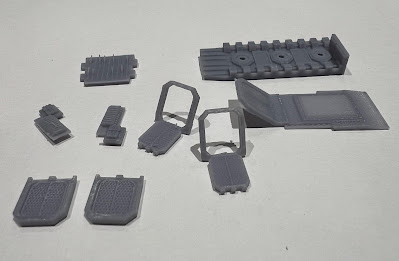
+ The kit comes as shown above, nice and clean with the supports removed. It's worth giving them a quick once over to clean things up, but this will take only seconds per part. There's no need to wash the parts or anything. +

+ You will need +

  • Sharp modelling knife
  • Superglue
  • Modelling files
  • Polystyrene cement
  • Modelling putty (optional)
If you want to hinge the front door, you'll also need:
  • Sellotape
  • Two small (~1mm) magnets
  • Paperclip
  • Clippers


_1  There are options for open or closed side doors: simply cut out the area shown and replace them on either side. You can use the existing detail to guide your cuts. I suggest that you dry fit the pieces repeatedly; trimming/filing away only what you need to to ensure a snug fit.

It's fairly obvious why you might want open doors for an interior detail kit, but why closed? The answer to that is that you will be able to see the sides of the interior through the front door, so even if you don't want open side doors, it's worth making the cut.


_2  The open doors can go in the same place. Since you get a pair of each, you can have both open, both closed, or – as here – one of each. Open doors are probably more appropriate for landing dioramas, but I wanted to pop a spare infantryman in the open doorway for a little extra character.


_3  The large angled part is designed as the floor for the insides. Glue it on as shown before assembling anything. There's a little notch that slots in neatly to the floor, so it's easy to find the correct position. 

If you want a functional ramp, avoid getting any glue close to the front (left side of the image) – see step 7 below.

Once glued, hold the piece until the superglue dries to ensure it is flat against the surface, then dry-fit the sides. You'll find you have to trim away the internal supporting struts shown in the centre of the picture. Don't worry, as the top part will fix any lost structural strength.

Also visible in this shot are the two sides. Note that I've popped out the dry-fitted side doors to avoid damaging them while I trimmed away the internal support. 


_4  It's now time to start assembling things. Start by gluing the side doors and boltgun racks as shown. Once these are dry, add some polystyrene cement to the remaining plastic supporting struts and some superglue to the sides of the remaining large upgrade part. This is the roof, and it fits in as shown above.

Note that there's a bit of play for this top part – it will slide slightly forward or back in the space. I opted to slide it forward, but everything should still fit if you push it a little backwards, too.


_5  Carefully trim away the front ramp from the plastic part by repeatedly scoring a straight line. Don't use clippers or force with the knife, or you'll distort the plastic. Check that the replacement front ramp with internal detail fits.


_6  This is a good time to paint the insides of your Thunderhawk. For the purposes of this step-by-step, I've just given them a quick spray – but feel free to go to town. 


_6  Glue the bottom part in place so you have a stable structure. Once dry, if you want a functional ramp, slide your knife blade between the plastic bottom part and the upgrade internal floor as shown. 


_7 Use your knife and files to cut two small recesses in the top part – check that your small magnets fit inside.

Cut a 3 x 1cm (1¼ x ¾in) strip of sellotape, and carefully slide it into the gap, sticky side up. Leave about 1cm (¾in) showing. 

Before moving on to the next step, paint the ramp to a finished state. I've added a little weathering to demonstrate (see below).


_8 Superglue the magnets in place. Note that the polarity doesn't strictly matter with this approach. 

Use a round or rat-tail file to file a groove in the top of the ramp, and glue a length of paperclip into the groove. Align the ramp with the hinge at the bottom of the Thunderhawk and press the sellotape into place. It will remain visible, but as you can see, it's not obtrusive.

The ramp will now open and close. You can assemble the rest of the Thunderhawk per the box instructions. 

+++

+ Finessing – or learning from the process +

+ As always, working through a process teaches you what to do better next time – so to benefit from my mistakes, here are some further thoughts. +


+ I only noticed after the whole thing was glued together that the open ramp reveals quite low headroom! I suggest that you trim down the front supporting area (the bit the magnets are in) before assembling the sides of the model. +

You might wish to use some greenstuff to help fill the holes for the magnets, too. +

+ If you'd prefer a sturdier or more professional quality for your hinge, you might replace the sellotape with higher-tack tape, or something purpose-made, like hinge tape [+noosphericexloadlink embdded+]. +


+++

+ What's in the box? External Detail kit +

+ Battle Bling's other offering for the Thunderhawk is the External Detail kit. No prizes for guessing what this eighteen-part upgrade is concerned with. +


+ Assembly for this is far more straightforward than the Internal Detail kit, so rather than a full step-by-step, I'll just give you some pictures and notes. +

+ The most obvious additions here are the turbolaser and tail. The turbolaser is a purely visual tweak that makes the design better match those of the Adeptus Titanicus laser weapons. This simply slots into place to replace the plastic version, using the same notches. +

+ The tail is my favourite bit. Not quite sure why GW lost the top of the tail in the redesign, but BB's upgrade replaces it. Again, this slots neatly into position, utilising the existing detailing to help you get the position spot on. +

+ Fully assembled and ready to drop off – or pick up – Astartes. +

+ Also visible on the left are the underwing lascannons and bombs. These are a visual upgrade (although perhaps they have rules in Aeronautica Imperialis?) and despite my love of heavy bolters, I quite like the gun barrels poking out from the wings. The underwing lascannons are two-parts each: the paired guns themselves, and the turret fittings (the round items in the picture at the start of this review). I assembled the turrets separately then glued them to the wings, but you could put the fitting in place before adding the guns in situ – just make sure you get them the right way round. +

+ The bombs fit into the gaps for the standard plastic missiles – and again, in Epic: Legions Imperialis terms, are just a nice visual difference, as the Thunderhawk doesn't have any in-game options. I opted to have a mix of missiles and bombs: the shattered Salamanders have to make do with what they can get hold of! +

+ Also included in the kit are two side sponsons. These are designed to fit in front of the side doors. I dry-fitted them and they fit very nicely – I simply opted for the standard heavy bolters because I like how they look. I'll save the lascannons for another day – perhaps another Thunderhawk or, as the size looks about right, to add some variety to a Land Raider squadron. +


+++

+ Notes +

+ The new Thunderhawk Gunship's a delight to build straight out of the box; and both sets of Battle Bling's excellent upgrades offer a lovely bit of icing on the cake. While not necessary, they are fun and add a lot of flavour to the standard kit. The Thunderhawk is a big model in Epic scale terms, and an obvious focal point. It's nice to be able to lavish some extra attention on it. +

+ While sturdy enough for gameplay, I'd suggest that the Internal Detail kit is ideal for superdetailed dioramas. There are even small holes in the (see step 4 of the Internal Upgrade instructions above), which might allow some talented electopriest to light up the insides... It's a great upgrade kit for anyone who wants to really get into the modelling aspect of the hobby. +

+ If you're on a budget, are more concerned about gaming, or aren't very confident in modelling, then I'd recommend the External Detail kit. It's a great introduction to third party upgrades, and is – for obvious reasons – much easier to spot at tabletop distances. +

+++

+ If Battle Bling are looking for future ideas, I'd love to see an upgrade set that replaces the plastic top, giving us the crew compartment and a top part with holes for the windscreens instead of solid plastic (some blister plastic could be used for the armourglass, as on my Blood Angels' Rhino). +

+ I'd also love to see the forward heavy bolter sponsons from the older design (pictured below). As with the crew compartment suggestion, this would give the kits more obvious visual differences from the stock kit. +


+ Size and dimensions of the LI/AI Thunderhawk +

+ Since posting up the review, a few requests have come in for the dimensions, so I got some pictcaptures. With my setup, there's some inevitable lens distortion, so I've added the length in the captions for clarity. Other than that, these pics are pretty straightforward. +

+ Length from tip of nose to end of engine nacelle: 120mm +

+ Another shot of the overall length 120mm +

+ Width from wingtip to wingtip: 110mm +

+ Height from ground (including deployed landing gear) to top of tail: 48mm +

+++

+ And finally +


+ There's a small subset of people – likely fans of Epic – who might have picked up the old resin Thunderhawk from Forgeworld when the first edition of Aeronautica Imperialis was out. Epic and AI 1st ed. were not a well-supported game at the time, so there aren't too many of these models out there. +


+ For this little niche audience, however, the following comparison pictures might be handy. As you'll see, the new plastic kit is larger – but not by the huge extent between the new and old Epic kits. If you've got the old resin Thunderhawk, you'll be pleased to hear that they'll look fine on the board – the differences in size perfectly attributable to different STC build patterns. +


+ Hope the review and pics are handy. +

+++